UIButton: Padding Between Image and Text
May 5, 2019
Update (11/29/2020): I've updated this post to note that more subtlety is required to account for right-to-left languages.
Pop quiz: in a UIButton, how do you set a padding of 10pt between the image and the title?
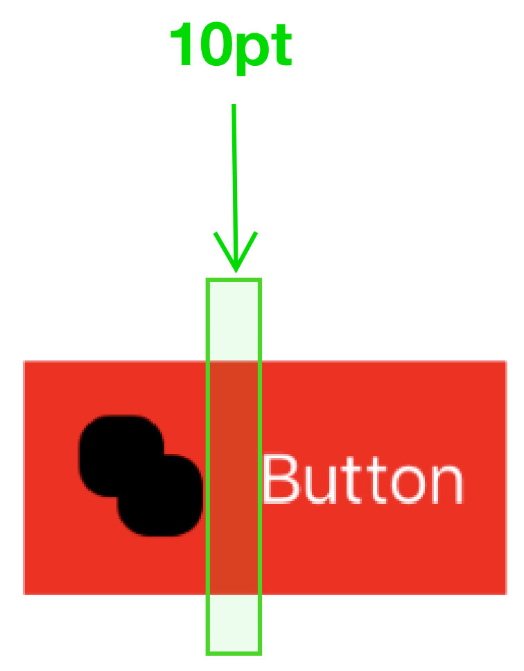
I had to do this at work recently, and I was surprised at how hard it was to reason about. There are several posts talking about this topic (including this one which uses edge insets to flip the title and image!), but the answer for my use case was pretty hard to find.
Adding image-title padding is possible, but takes some trickiness with contentEdgeInsets, titleEdgeInsets, and imageEdgeInsets.
UIButton Insets
To understand why adding image-title padding is hard, we have to look at UIButton's various insets properties, which control how the UIButton is drawn (in different ways).
contentEdgeInsets
contentEdgeInsets is probably the easiest insets property to reason about. The insets apply padding to the content of the button, and they're taken into account in the button's instrinsicContentSize (which was what I expected).
- Positive values expand the button away from its content
- Negative values contract the button towards its content
With negative contentEdgeInsets, it's possible to get the image and text to draw outside of the button's bounds.
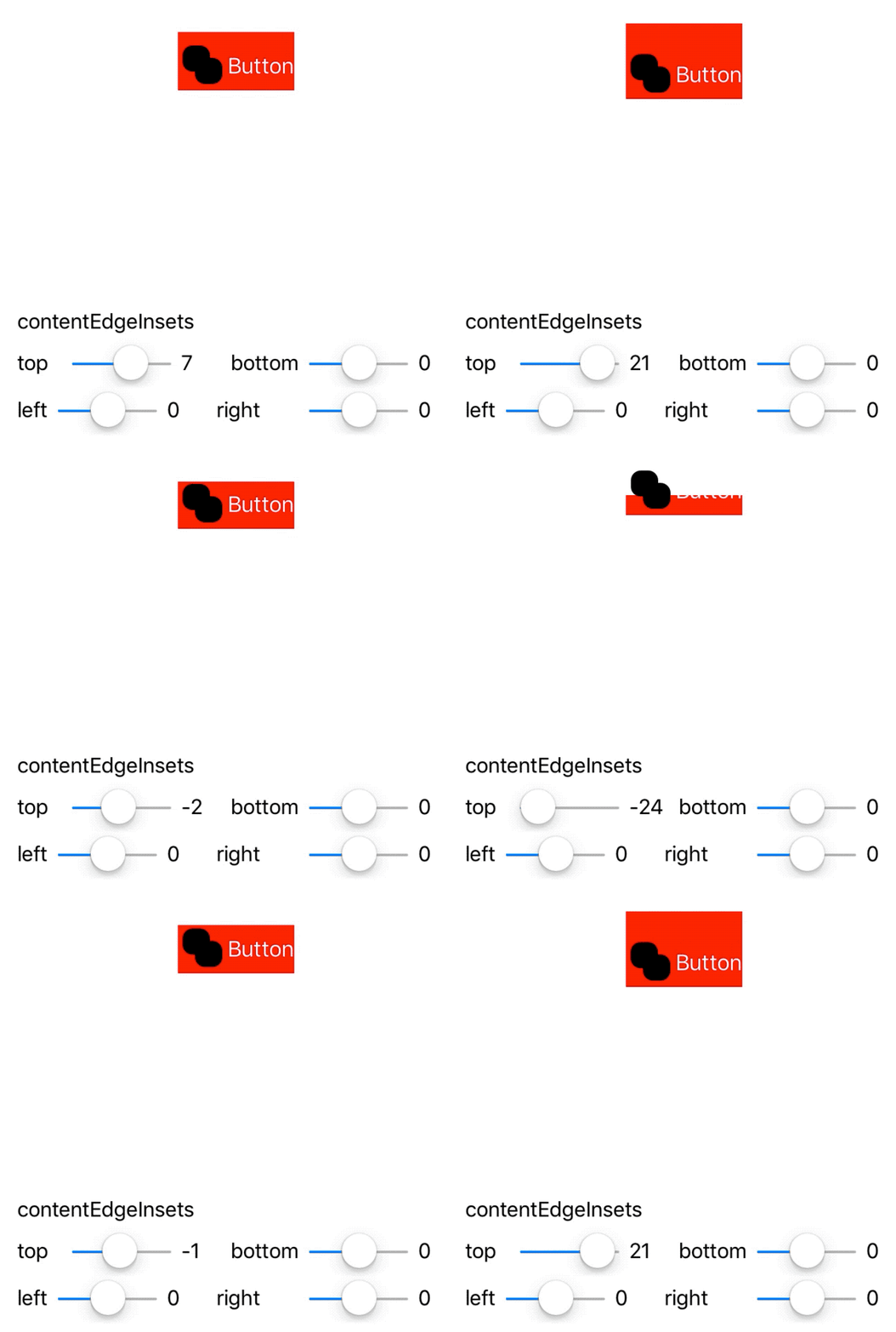
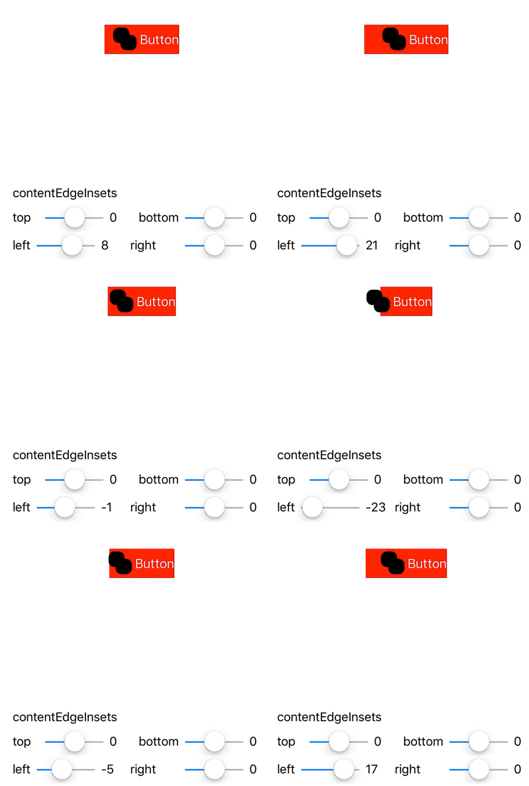

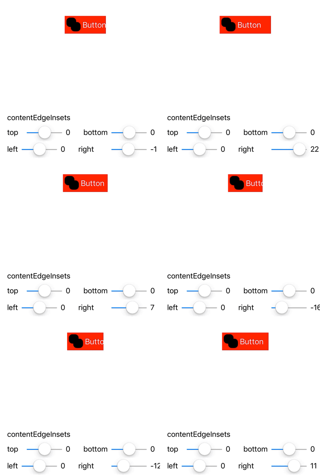
contentEdgeInsets is the closest thing available to "padding" within UIButton.
imageEdgeInsets
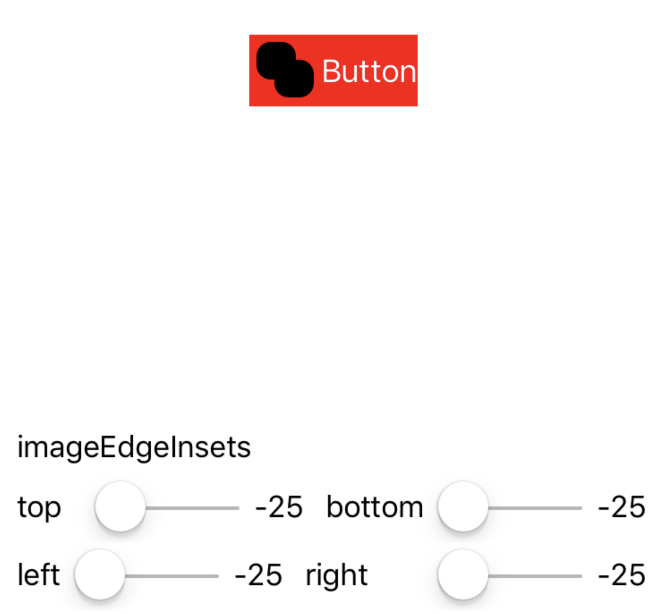
imageEdgeInsets affects the drawing rect of the button's image, and does not figure into the button's intrinsicContentSize (this is different than contentEdgeInsets, which contributes to the intrinsicContentSize).
- Positive values contract the drawing rect towards the image's center
- Negative values expand the drawing rect away from the image's center
Because imageEdgeInsets modifies the drawing rect, setting positive values can result in a squished image - with correct insets, you can actually flip the image! Negative values have the effect of translating the image, they expand the drawing rect back instead of contracting it.
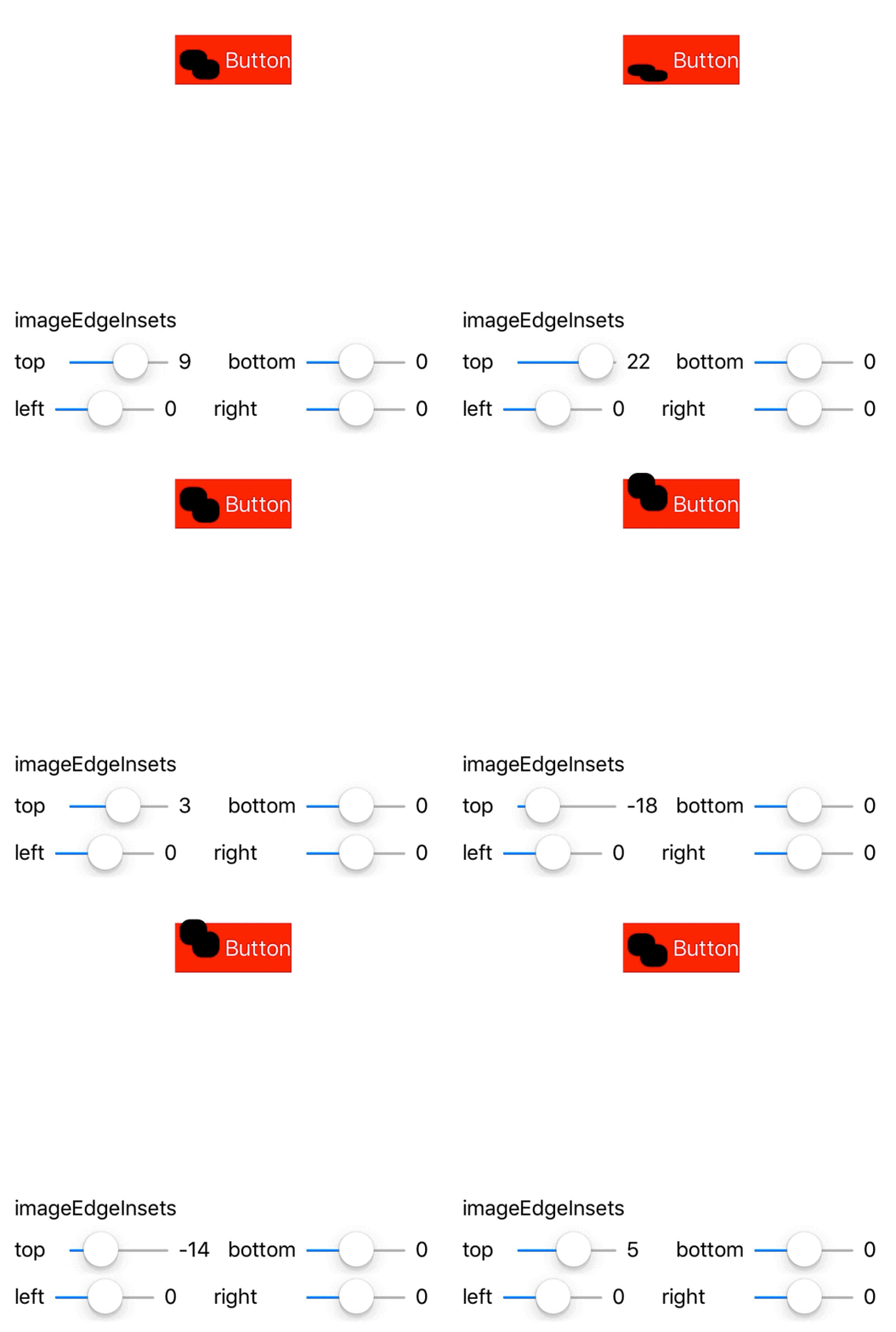
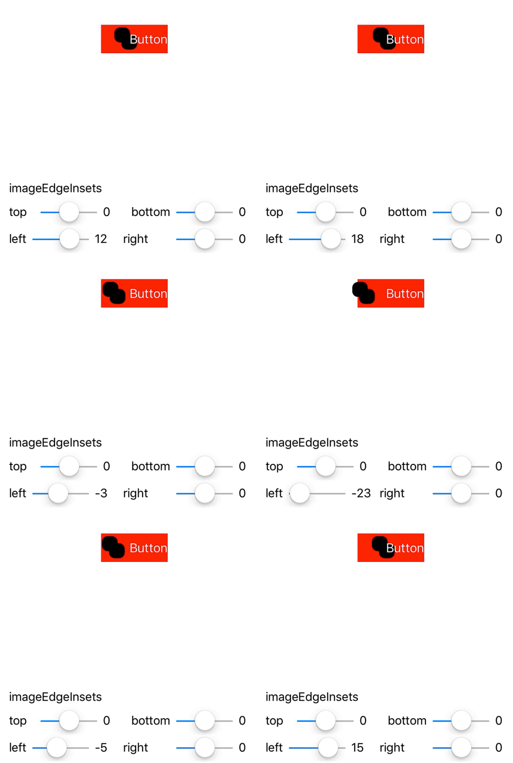
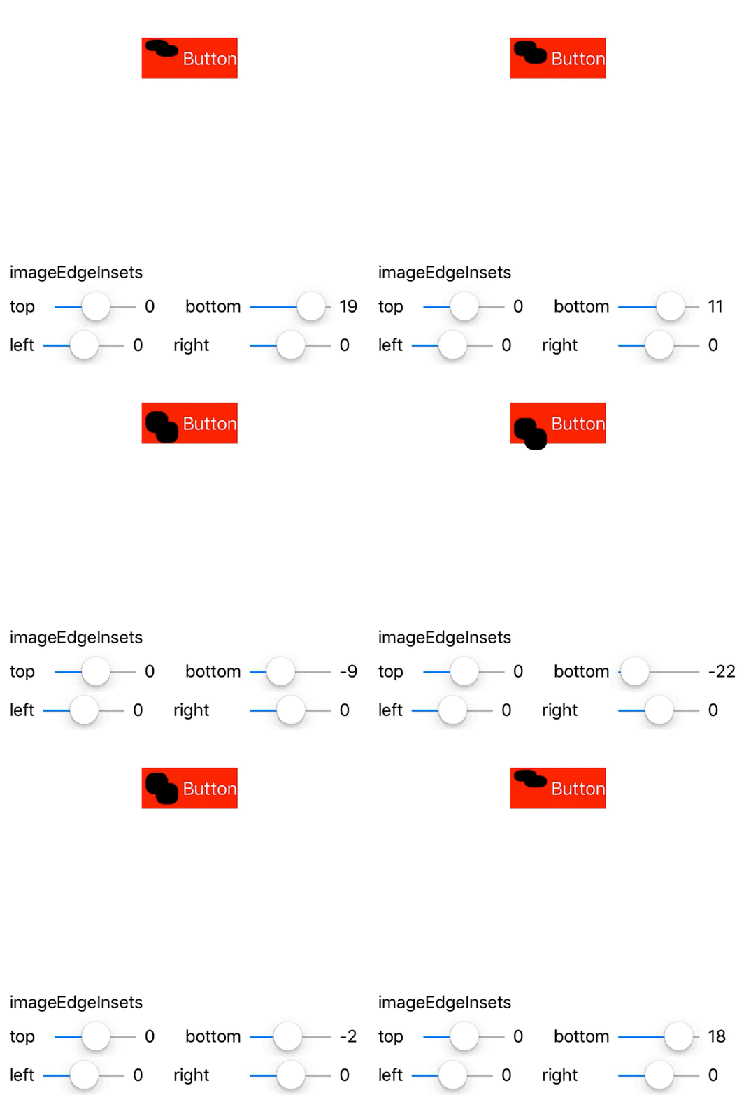
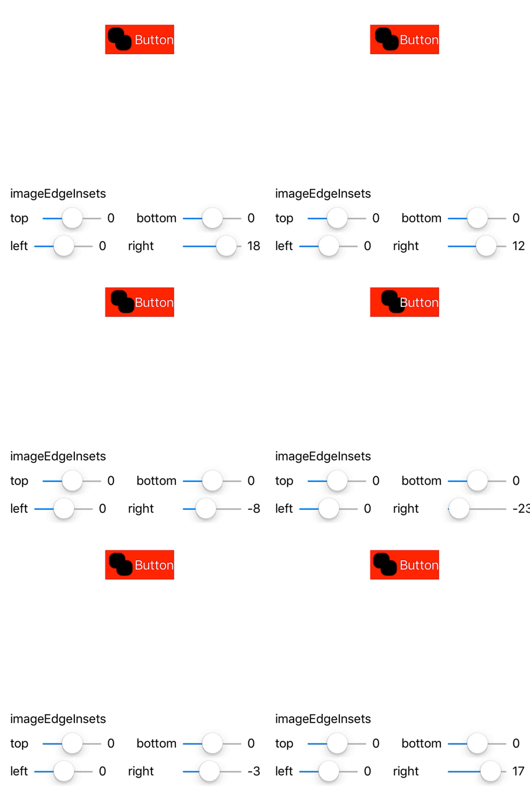
Interestingly, UIButton seems to have some issues with positive left and right edge insets - if you have an idea of why, please let me know.
Also interestingly, negative values of equal magnitudes cancel each other out!
titleEdgeInsets
titleEdgeInsets affects the drawing rect of the button's title, and like imageEdgeInsets does not contribute to the button's intrinsicContentSize.
- Positive values contract the drawing rect towards the center of the title
- Negative values expand the drawing rect away from the center of the title
As the title's drawing rect compresses (i.e., as positive insets are added), letters get cut off with ellipses. As with imageEdgeInsets, negative values translate the text without otherwise affecting the button's layout.
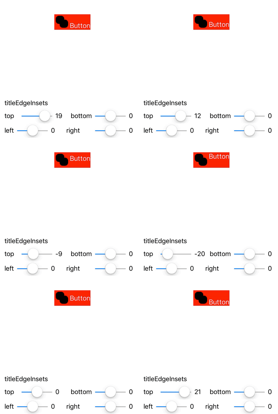
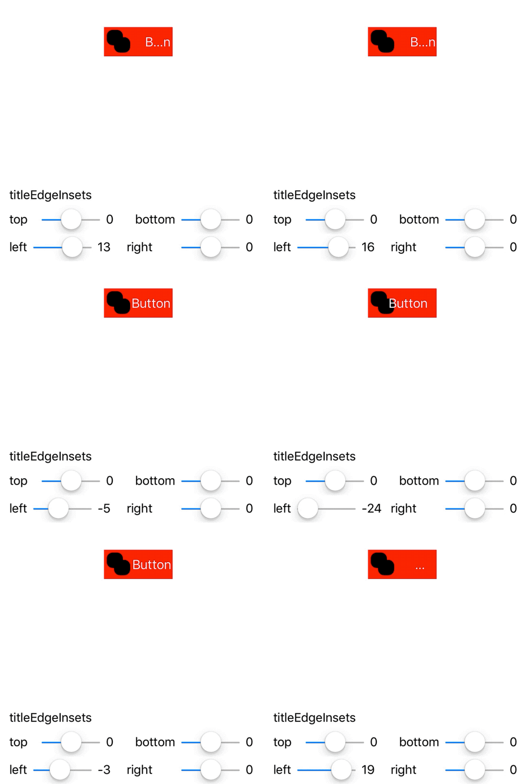
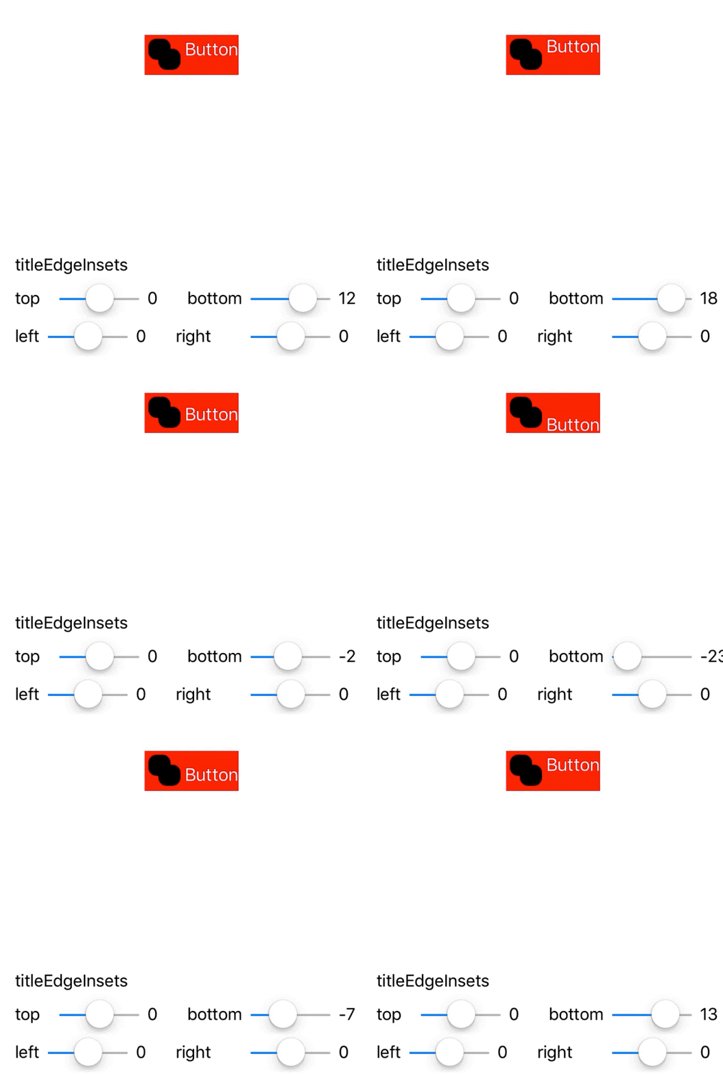
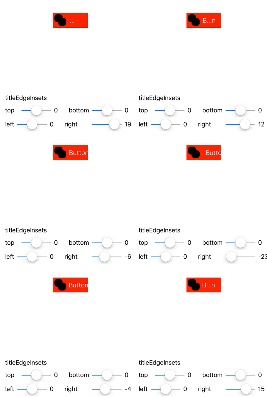
Image-title padding
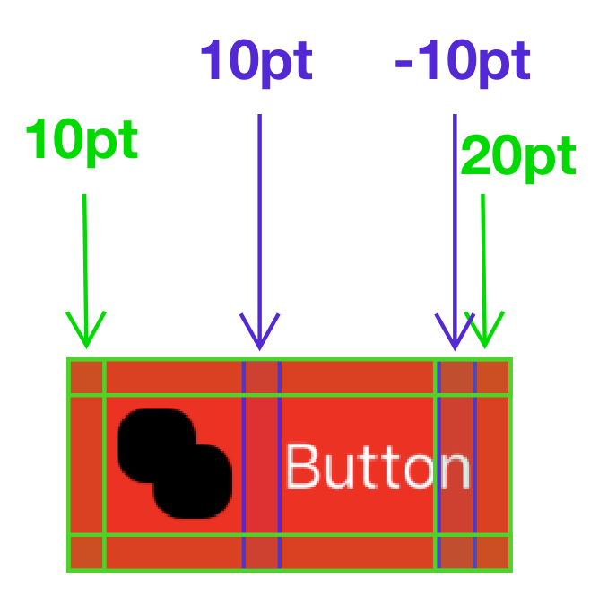
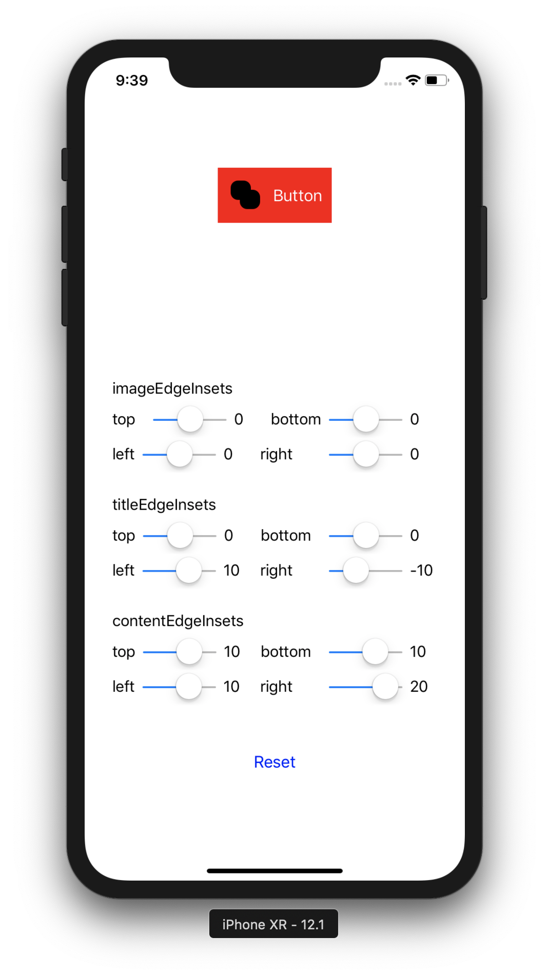
Though there's no built in way to put padding between the image and the title of a UIButton, we can fake it by using what we know about the various inset properties. Let's assume we want a button with 10pt padding around the content and 10pt padding between the image and the title. We'll:
- Add 10pt to all edges of the
contentEdgeInsets - Add 10pt to the left edge of the
titleEdgeInsetsto shift the button to the right - Add negative 10pt to the right edge of the
titleEdgeInsetssince we have to make sure the button doesn't get cut off by ellipsis - adding this negative padding preserves the text's original drawing rect - Add 10pt more to the right edge of the
contentEdgeInsetsto account for the button being moved 10pt to the right
The final product ends up looking like this:
Once we know how to do this, we can extract it to a method:
extension UIButton {
    func setInsets(
        forContentPadding contentPadding: UIEdgeInsets,
        imageTitlePadding: CGFloat
    ) {
        self.contentEdgeInsets = UIEdgeInsets(
            top: contentPadding.top,
            left: contentPadding.left,
            bottom: contentPadding.bottom,
            right: contentPadding.right + imageTitlePadding
        )
        self.titleEdgeInsets = UIEdgeInsets(
            top: 0,
            left: imageTitlePadding,
            bottom: 0,
            right: -imageTitlePadding
        )
    }
}
Right-to-left languages
In locales which write right-to-left, content and image insets have their right and left insets reversed, since the image is to the right of the text. In RTL environments, it's necessary to adjust the setInsets method as such:
self.contentEdgeInsets = UIEdgeInsets(
    top: contentPadding.top,
    left: contentPadding.left + imageTitlePadding,
    bottom: contentPadding.bottom,
    right: contentPadding.left
)
self.titleEdgeInsets = UIEdgeInsets(
    top: 0,
    left: -imageTitlePadding,
    bottom: 0,
    right: imageTitlePadding
)
Unfortunately, UIButton doesn't have support for NSDirectionalEdgeInsets currently, so you have to query the userInterfaceLayoutDirection to figure out whether to use the right-to-left version.
Conclusion
Hopefully this post helps some folks wrap their heads around a weird UIKit API. If you're looking for a truly customizable UIButton, don't forget that you can subclass UIControl directly and use your own layout entirely - I did this for Trestle and it worked well, even when I needed SVGs (!) inside the button.
If you're interested in learning more about what I've built with UIKit (like making UINavigationController animate inside a popover), you can follow me on Twitter.
The code for all the examples in this post can be found at NGUIButtonInsetsExample.

Noah Gilmore
I'm Noah, a software developer based in the San Francisco Bay Area. I focus mainly on full stack web and iOS development
- 💻 I co-founded Replo, a no-code platform for e-commmerce
- ✍️ You can read technical posts on my blog
- 📱 I wrote an app which lets you create transparent app icons called Transparent App Icons
- 🧩 I made a puzzle game for iPhone and iPad called Trestle
- 🎨 I wrote a CoreImage filter utility app for iOS developers called CIFilter.io
- 👋 Please feel free to reach out on Twitter / 𝕏