Tweet not found
The embedded tweet could not be found…
December 16, 2020
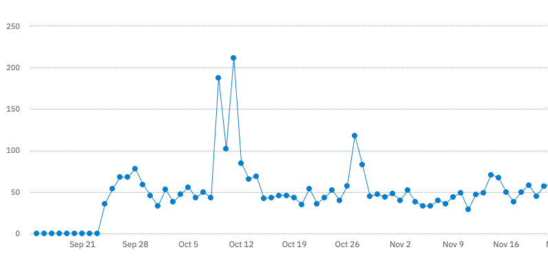
This September, I developed and released an iOS app called Transparent App Icons. I wrote the app (or at least, the app’s initial version) very quickly, and it’s paid off in terms of the time I put into it - in addition to being a great learning experience from a technical and business perspective, it’s generated $3,000 in earnings since launch, which means it’s the first app I’ve put on the App Store which will contribute nontrivially to my paycheck.
I learned a lot from this experience, so I’m writing this post as a retrospective in order to give some context on the independent iOS app development process, give you an idea of what to expect if you want to launch your own app, and demonstrate how powerful it can be to make small bets with projects like this.
The title of this post is intentionally tongue-in-cheek: though I submitted the app for review two days after starting work on it, I hope by the end you’ll see how it actually took quite a bit of ongoing work.
On September 21st at around 9pm, I happened to be scrolling through Twitter and saw this tweet:
The embedded tweet could not be found…
I knew that iOS 14 allowed users to launch apps with Siri shortcuts, which had led to a viral trend of users customizing their Home Screens with aesthetic icons and widgets. The transparent icons tweet had 200K+ likes, so I knew that this must have importance to some people, and the technique that was getting so much traction was basically "take a screenshot of your Home Screen, go into Photoshop and individually cut out app icons, then overlay a PNG you found online."
I thought there had to be an easier way, and I knew a lot of the people trying to create aesthetic Home Screens were using their phone (not a laptop/desktop). Surely, an app could do this better. I posted a tweet just to make sure I wasn’t missing anything obvious, and I searched the App Store for what I thought I would search for if I wanted an app which made transparent app icons: “transparent app icons.” There were no results, so I decided that for App Store Optimization, that’s what I should name the app.
I went to bed that night and spent at least an hour lying awake, thinking about what I wanted the app experience to be. I knew that in order to capitalize on the iOS 14 trend, I had to release the app as fast as possible. I was excited about it, and fixated on it. The next day I woke up at 6am, made myself a cup of coffee, and got started on it as soon as I could.
I kept a Twitter thread going with progress, and I think this ended up being a really great idea. Not only did people enjoy following along, but I got some help from the community around SVG device vectors and even some feedback on the icon. Shawn Wang has a popular post about learning in public, and I think this accomplishes a similar goal - being open about your process helps you stay motivated and accountable, benefits everyone who reads about it, and helps avoid the dreaded side project graveyard.
On the night of the 24th, after spending a bunch of time putting in the finishing touches, I submitted the app for review. I intentionally restricted it to the absolute minimum feature set - select a background image, select an app icon from the grid, save the cropped transparent image to use as a shortcut icon. Funnily enough, the main feature of the app which people seem to use today (overlaying built-in icons on the "transparent" images) wasn’t included at all.
I think the necessity of getting the app out fast to "capitalize on the trend" meant that I didn’t fall into the hole of wanting to add more and more little features before launch (one I’ve fallen into many times). I’m hoping to apply this to any project that I launch going forward - I think the golden rule of shipping the minimum and iterating applies just as much to indie app development as it does elsewhere in software.
Side note: the fact that I even had time to devote to this project outside of my day job is a privilege that I want to acknowledge. To that end, no one should feel bad about not being able to ship something in any timeframe, especially if you’re learning a new programming language or framework along the way - the main reason I was able to write this app so fast was because I already had a ton of past experience writing apps anyway! Whether it’s 2 days, 2 weeks, or 2 months, what’s important is recognizing what you can do to provide the minimum value and getting something out the door.
By the time the app was released, I had drummed up a tiny bit of following from the Twitter thread, but not nearly enough to get it in front of the audience that I wanted. So while implementing "fast follow" features like overlying logos on the transparent icons, I started to think about marketing. I’m no social media marketer, but here are a few things I tried and how well they worked:
Twitter: I started by creating a thread detailing how to use the app to create transparent icons, in the style of the original thread which I got the idea from. Then, my approach was to search Twitter for keywords like "transparent icons" or "clear icons" multiple times a day, and when I found someone asking about transparent iOS app icons I'd link them to the thread. The thread didn’t take off as much as I hoped it would, but I was definitely able to get some initial traction this way.
Instagram: I made an Instagram account for the app and started basically liking and following any account which posted iOS 14 related hashtags. It’s hard to know how much this worked, but it wasn’t ineffective, at least - around 100 people started following the account, and the posts (screenshots, in-development features, or Home Screen setups I created just to have content to post) got likes and comments, and some people reported bugs by messaging the app account.
I had the idea of identifying high-follower accounts who were posting about iOS 14, creating promotional Home Screens which matched their aesthetic, and tagging them in my Story with the hope they’d repost and boost my reach. This happened a few times, but unfortunately it didn’t result in more engagement with the account’s content or downloads. I guess people just swipe through these stories - it probably would have been better to reach out to these creators and offer them promo codes directly. According to App Store Connect analytics, the App Store link in the Instagram account’s bio has only accounted for something like 20 sales over the app’s lifetime, so it was overall only effective as a communication platform.
Reddit: There were various subreddits where people were posting about iOS 14, which I found through Reddit searches - r/iossetups was the biggest one. I took the approach of trawling through the comments, finding people talking about transparent icons, and linking them to the app. I also posted the promotional screens I made there, and at least one post got 600+ upvotes and 50+ comments, and resulted in a small bump in downloads. The best thing I got from reading Reddit comments was information on the competition, though - more on that later.
Youtube: This is where I was actually able to hit the mark well. There were a ton of videos talking about iOS 14 customization, which you could find easily by searching for things like "clear app icons." I’d comment on these videos telling folks that they might be interested in the app, then message the creators privately (via email or Instagram, or whatever platform they said they were available on) and tell them about the app with a promo code.
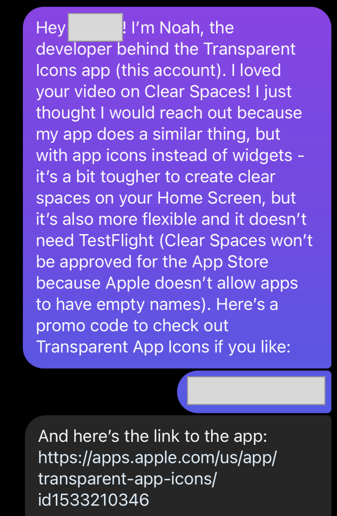
I think this ended up working because it was a win-win - these creators found out about content their audiences cared about, and the app got more publicity. First All I Talk Is Tech then iDevice Help made videos about the app, which catapulted downloads to more than 200 a day for a couple of days. That seemed to be enough of an activation energy to get the ball rolling - shortly after this I started realizing that marketing was taking up a ton of my time, and I had to ramp it down, but downloads stayed relatively constant around 40-50 a day.
This also provided the trampoline to have further interactions on Twitter - people messaging about the app, promo code giveaways on smaller accounts, getting connected with the developers of similar apps, etc. The promo code giveaways (like this one) were an interesting marketing mechanism - sometimes they worked and sometimes they didn’t, but at best I traded 5 free downloads (via promo code) for 20+ paid ones.
The strategy wasn’t unique to YouTubers either: I reached out to the author of this article on 9to5Mac, since the article was about Clear Spaces, which had a similar audience. They added a link to my app there as well, which resulted in a big download bump.
Lastly, I got in contact with the developers of Clear Spaces and Iconboard (two popular apps in the same product space), and we agreed that it would be mutually beneficial to cross-link the apps - both apps now have a link to Transparent App Icons under their settings menus, and I link back. I got this idea because I follow the developers and they’re doing great work, but I wasn’t sure what effect it would have on downloads - turns out that these two app referrers accounted for 22% of Transparent App Icons units last month!
I think the takeaway here is that you have to try everything and figure out what works best for your niche. I was lucky that I eventually stumbled onto the idea of promoting the app directly to content creators, but that won’t work for every app - try a bunch of stuff, including things very specific to your app’s context, and see what sticks.
I realized during the post-release period that there were other ways to create transparent icons. iEmpty and Makeovr have websites that do very similar things, and there’s a Shortcut floating around which does most of what Transparent App Icons does. There were downsides to each, though: iEmpty has a ton of ads, Makeovr hasn’t been updated for new phones, and the Shortcut isn’t discoverable and is harder to use than an app. There was also an App Store copycat which got eventually removed, but that’s a story for another time.
My strategy when people would post links to these competitors was just to ignore them and focus on my bet that having the convenience of an app with full support for all devices and a responsive customer support contact (me) would be worth the 99c paid-up-front price of the app. All the while, I knew none of the competitors had functionality to overlay common logos over the transparent icons, and I knew this is what a lot of users wanted (since I had launched early and had people reaching out to support via email). So while I was marketing, I was also iterating on the app by adding overlay functionality.
My point is: if you have an idea which you think might be good for an app, don’t discount it just because another solution exists. Try out the competition, see if it solves the problem, and see if there’s space for your idea - in this case, the presence of competitors didn’t preclude the success of Transparent App Icons.
Now let’s get down to the nitty gritty - here’s some transparency (hah) into Transparent App Icons’s numbers. Usage analytics come from Amplitude, which I highly recommend for independent app developers, and from App Store Connect analytics.
I’m sharing these numbers publicly because I hope it will provide insight for folks who are thinking about writing apps but haven’t yet - if there are any other parts of the analytics you’d like to see, don’t hesitate to reach out.
The app launched on September 24th, so at the time of writing it’s been live for 84 days.
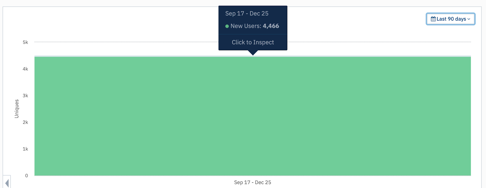
In that time, 4,466 unique users have downloaded the app. I’ve given out 42 promo codes and there were 100 spaces in the Testflight beta test, so around 4,324 of those users represent paid downloads (the app is a one time, 99 cent purchase).
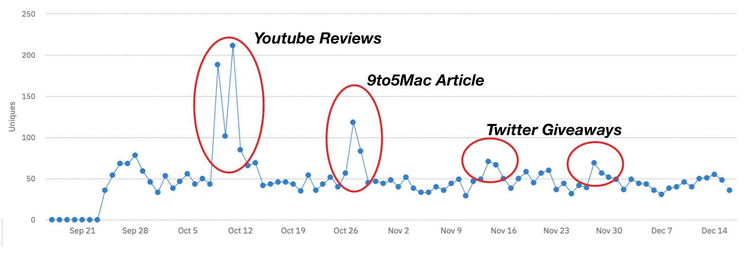
This graph charts new users daily - each unit is a paid download (less promo codes and Testflight). This is the main graph I usually look at to see if the app is performing well. There’s an initial bump for the launch, huge bumps for the Youtube reviews and the 9to5Mac article I mentioned earlier, and smaller bumps for Twitter promo code giveaways. Other than that, downloads seem to have reached an equilibrium around 50 per day, which is really great considering that I’m doing almost no marketing for the app at all nowadays. I fully expect this to decrease in the future as the hype for home screen customization dies off, but we’ll have to see - maybe iOS 15 will implement some fancy new customization that I can hook into.
Here are the App Store analytics over the same period:

I have no idea whether these conversion rates are good or not (if you do, let me know). Impression to product rate of 14% seems really great, and 1.36% download rate doesn’t seem bad either, for a paid app. Maybe there’s some more optimization I can do with screenshots or the app description to improve this.
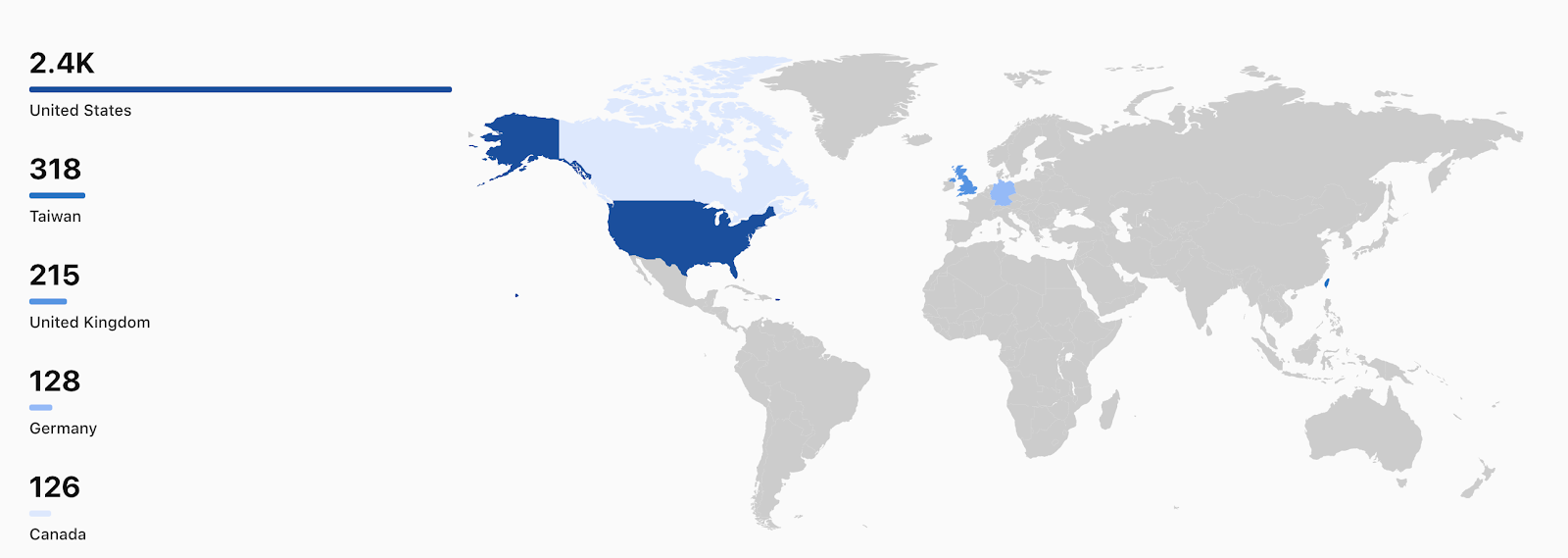
App units are mostly in the US, which is expected, but there are a surprising number of downloads in Europe and Taiwan. It’s possible that this might be worth an investment in localizing the app into various languages, so that’s something I’ll be looking into in the future.
Finally, the app has been hovering around #2-#7 in the Graphics and Design category on the App Store since launch - I’ve come to believe that this is just not a very crowded category, since it’s generally the same ~10 apps occupying different spots in the top of the chart. I believe choosing Graphics and Design for the primary category was a good decision, as opposed to a more crowded category like Utilities.

It’s quite surprising to me that so many downloads come from App Store search - I guess the strategy of naming the app for ASO paid off here, but if you look at the chart below you can also see that those searches were mainly associated with the initial launch and the Youtube reviews. The app is the first result for “transparent icons” and “empty icons” but not “clear icons,” which is interesting because “clear” is the second keyword in my keywords list.
To be extra transparent, here’s the full keywords list I’m using: "transparent, clear, spaces, iconboard, empty, icons, icon, background, ios14, homescreen, widgets, wallpaper" - a combination of trying to figure out relevant terms and surface the app next to other popular, related apps. Interestingly, it’s the 3rd result for “clear spaces” and the 7th for “iconboard,” so it seems other apps are using the same strategy.

This chart shows the referral sources over time - though initially App Store search/browse were the top referrers, the integration with Clear Spaces and Iconboard drove App Referrer to the top.
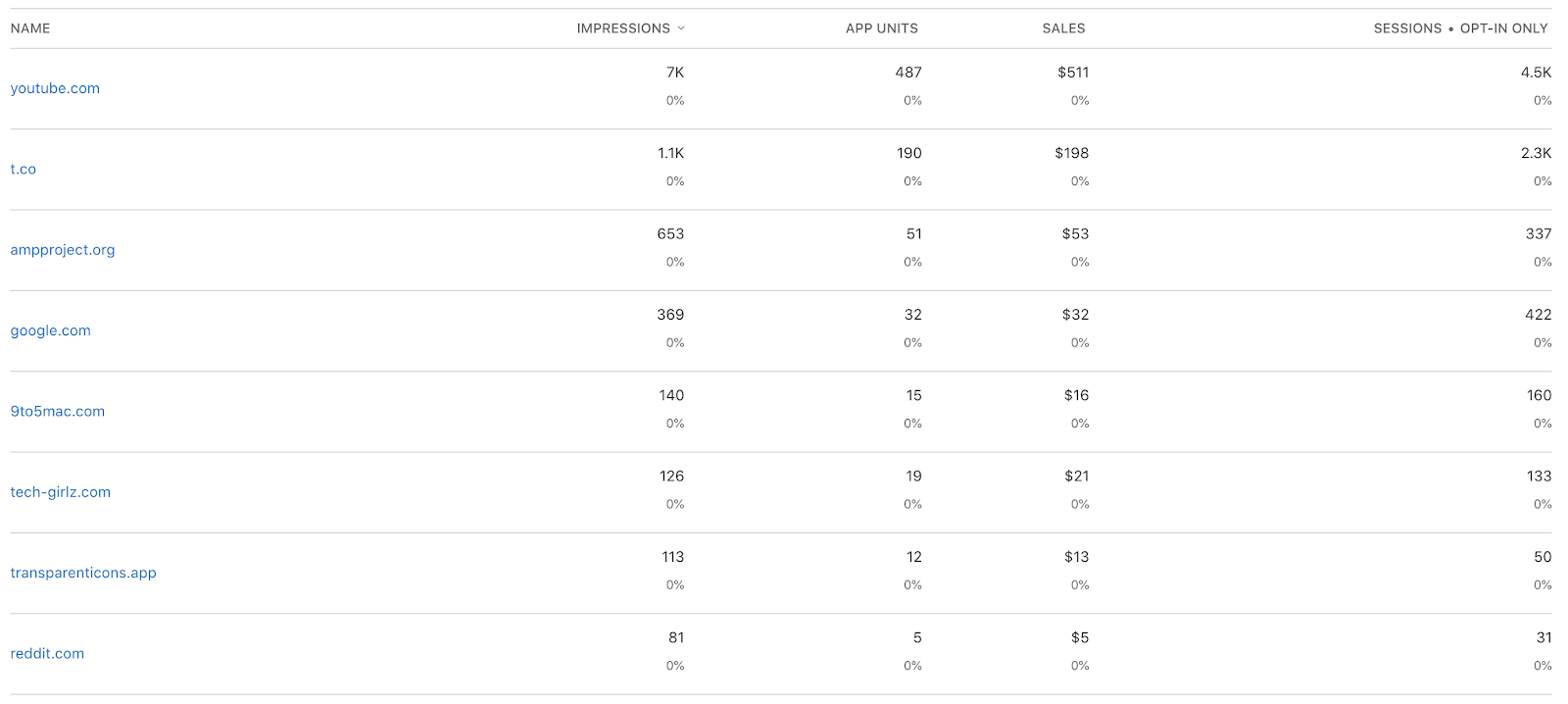
The web referrers section is very interesting - Youtube and Twitter really paid off, and just one link in a 9to5Mac article was enough to put it on the web referrer chart.
The number that ultimately matters is proceeds, of course: $4,300 in sales translates to about $3,000 in (pre-tax) earnings, so if this keeps up it’ll be around 10-15k a year, due to Apple changing it’s revenue cut through the App Store Small Business Program. Though it’s not enough to live on, it’s really humbling to have a real revenue stream, and I have to recognize how lucky I am to have an app like this contributing to my bank account.
I took an approach with Transparent App Icons that I hadn’t taken before - I tried to make the absolute minimum thing as fast as possible. To be honest, I didn’t know how it would turn out: Apple could have rejected it, it could have gone completely viral, it could have flopped, or it could have fit in somewhere in the middle, which is what ended up happening.
I think if there’s one thing you can take away from this post, it’s that there’s value in simple experiences that you can build fast. Make small bets - the worst that can happen is that you learn a lot, and the best that can happen is you create something really successful.
I’m about done investing in Transparent App Icons, I think - of course I’ll continue to fix bugs, maintain or make tweaks to the app, and maybe add new icons now and again, but the feature set is pretty much complete.
I didn’t really write the app in two days - I spent about two months on and off developing, iterating, and marketing it. But overall, I learned a ton about being an independent app developer through the process, and I’m happy with how it turned out. I’m hoping that you can take some of these insights and apply them to your own projects as well.
If you’re interested in more writing about app development (technical and nontechnical), you can follow me on Twitter.
Thanks to Rounak Jain and Emily Moody for proofreading drafts of this post.

I'm Noah, a software developer based in the San Francisco Bay Area. I focus mainly on full stack web and iOS development